How Color Psychology Drives Emotional Buying Decisions
Color is one of the most powerful tools in packaging design because it directly influences how consumers feel, think, and ultimately decide to buy. Long before a customer reads product details or evaluates features, color creates an immediate emotional response. This subconscious reaction can determine whether a product attracts attention, builds trust, or gets ignored. Understanding color psychology allows brands to design packaging that connects with consumers on a deeper level and drives purchasing decisions. Different colors evoke different emotional associations. Warm colors such as red, orange, and yellow are often linked to energy, excitement, and urgency. They can stimulate appetite and grab attention quickly, which is why they are frequently used in food and beverage packaging. Red, for example, can create a sense of passion or urgency, while orange conveys friendliness and enthusiasm. These colors are effective for encouraging impulse purchases.
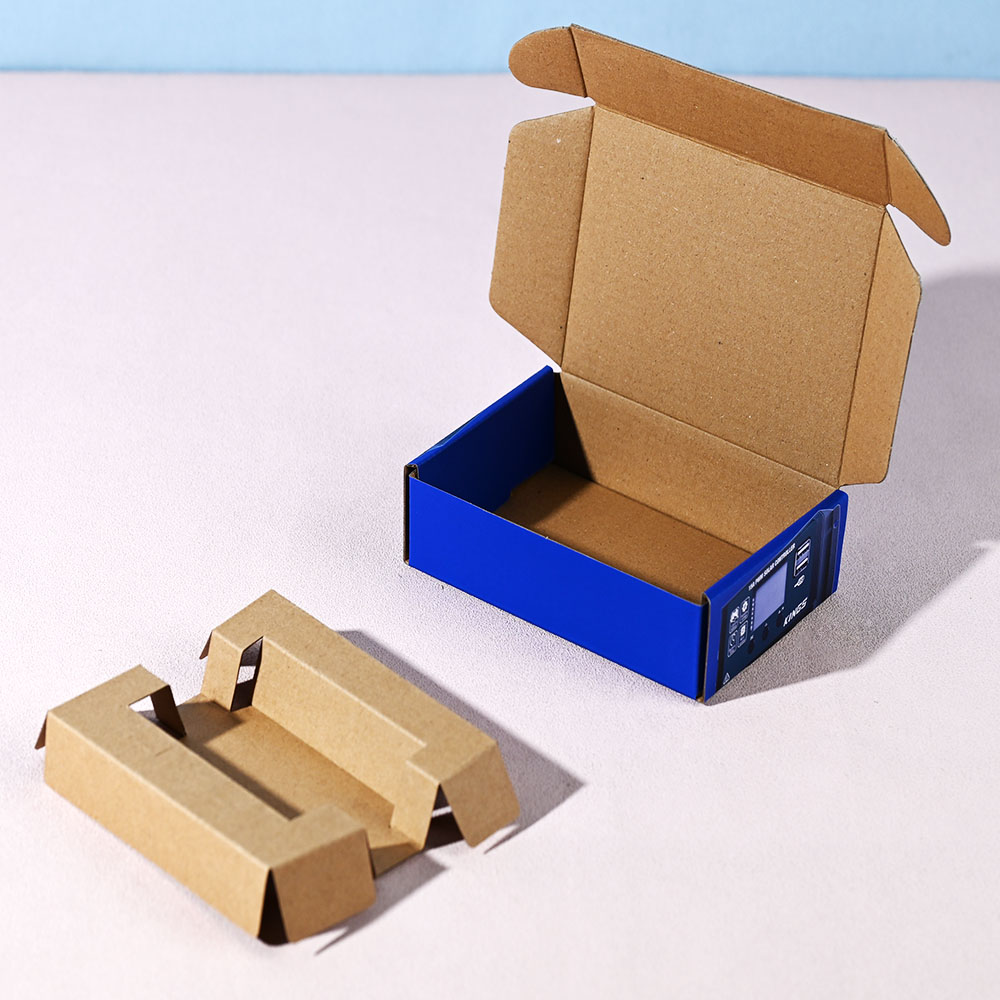
Cool colors like blue, green, and purple tend to communicate calmness, trust, and reliability. Blue is widely associated with stability and professionalism, making it popular in industries such as healthcare and technology. Green often represents nature, health, and sustainability, which appeals to environmentally conscious consumers. Purple can suggest creativity, luxury, or uniqueness, depending on how it is used. Neutral colors also play an important role in shaping perception. Black is often linked to sophistication, elegance, and premium quality. White conveys simplicity, cleanliness, and purity, making it common in healthcare and personal care products. Gray and beige can create a sense of balance and subtlety, often used in minimalist designs to support a refined aesthetic.

Beyond individual colors, combinations and contrast influence emotional impact. A bold contrast can create excitement and draw attention, while harmonious color schemes create a sense of balance and comfort. The way colors are combined can reinforce brand identity and help communicate specific messages more effectively. Consistency in color use strengthens emotional connection over time. When a brand repeatedly uses the same color palette, consumers begin to associate those colors with the brand’s identity and values. This familiarity builds trust and recognition, making it easier for customers to choose the product again in the future.
Cultural context also affects how colors are perceived. A color that represents luck or celebration in one culture may carry a different meaning in another. For brands operating in global markets, understanding these cultural differences is essential to ensure that packaging communicates the intended message. Color psychology is especially important in competitive retail environments. On a crowded shelf or a digital platform, products have only a few seconds to capture attention. The right color choice can make packaging stand out while also appealing to the target audience’s emotions. This initial attraction often determines whether a customer picks up the product or scrolls past it.
In addition to attracting attention, color can influence perceived product quality. Rich, deep tones and well-balanced palettes often suggest higher value, while poorly chosen or inconsistent colors can reduce perceived quality. This makes precise color management and printing essential in maintaining the intended brand image. Ultimately, color is more than a visual element—it is a communication tool that speaks directly to consumer emotions. By understanding how different colors influence perception and behavior, brands can design packaging that not only looks appealing but also connects with customers on a psychological level. This emotional connection plays a crucial role in driving buying decisions and building long-term brand loyalty.