

How Printing Order Can Affect the Appearance of Multi-Color Cartons
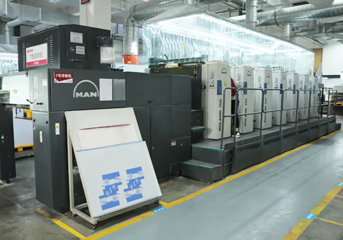
When a folding carton contains several colors, the final appearance depends on more than the ink shades selected in the artwork. The order in which colors are printed can influence color accuracy, image clarity, registration, and the way different areas appear after finishing. Even when the artwork is prepared correctly, an unsuitable printing sequence can make certain colors look different from what the designer intended. In offset printing, different ink colors are generally applied through separate printing units as the sheet passes through the press. The sequence matters because each ink interacts with the paperboard and, in some cases, with ink that has already been deposited. When colors overlap, their order can affect the resulting shade, particularly in areas where transparent process inks combine to create a specific color.
One clear example is the printing of large background colors alongside smaller graphic elements. If a carton has a dark background with fine text or bright details, the printing sequence needs to support both the background appearance and the clarity of the overprinted elements. Poorly planned color relationships can make small details less distinct or cause the finished design to look different from the approved sample. Color overlap is another important consideration. Many packaging designs use one color over another to create shadows, secondary shades, or specific visual effects. Since printing inks are not always completely opaque, the color underneath can influence the appearance of the color printed on top. Designers and printers need to consider these interactions when preparing artwork and determining the printing sequence.
Registration accuracy becomes especially important when several colors meet along a sharp boundary. If the printing sequence and press conditions do not maintain accurate alignment, small gaps or unwanted color edges may become visible. These defects can be particularly noticeable around logos, fine borders, small text, and contrasting graphic elements. The paperboard surface can also influence how printing order affects the result. Coated paperboard often provides a smoother printing surface, while other materials may absorb ink differently. The first ink applied interacts directly with the substrate, and subsequent inks may interact with an existing ink layer. This can influence how the final color develops across the printed sheet.

Drying and ink setting are also relevant. Depending on the inks, paperboard, coverage, and printing conditions, the behavior of one ink layer can affect the handling and performance of later layers. If the production conditions are not suitable, the printed sheets may develop issues during stacking or subsequent finishing. A well-planned sequence must therefore consider the entire production process rather than color appearance alone. Large solid-color areas require particular attention because they make variations easier to see. If a carton includes a broad background with smaller colored elements on top, the printer needs to maintain consistent ink density while preserving the appearance of the overlapping colors. A change in ink balance or registration can affect the overall visual impression even if each color looks acceptable when examined separately.
Special colors and metallic inks can introduce additional considerations. Spot colors are often selected to achieve a more specific or repeatable brand shade, while metallic inks depend on how their reflective properties interact with the substrate and surrounding printed areas. The position of these inks in the sequence may influence their appearance, so the printer should evaluate the intended effect using the actual production materials. Printing order can also affect how small text and fine details reproduce. When delicate elements are placed over a background color, the artwork may require suitable trapping or other adjustments to prevent visible gaps caused by minor registration variations. These decisions should be reviewed before production so that the chosen sequence supports both readability and visual consistency.
For packaging manufacturers, a practical way to evaluate printing order is to review the artwork, inspect areas where colors overlap, and produce a sample using the intended substrate and finishing process. This helps reveal whether the color sequence produces the expected appearance and whether any changes to artwork preparation or press settings are needed before the full run begins. Packaging buyers can support the process by providing clear color references, approved artwork, and information about which brand colors must remain especially consistent. They should also review the finished sample rather than judging colors only from a digital screen, because screens and printed materials reproduce color in different ways. The printing sequence is ultimately a technical decision that connects artwork, ink behavior, paperboard, registration, and finishing. When manufacturers consider these factors together, they can produce multi-color cartons with clearer details, more predictable color relationships, and a more consistent appearance across the production run.