Improve Your Color Printing Employing Color Theory
In the competitive world of packaging and custom printing, color plays a central role in capturing attention, communicating your brand message, and influencing consumer behavior. However, successful color usage in print isn’t just about choosing visually appealing shades—it's about understanding and applying color theory. At Wuxi Box Printing Technology, we integrate professional color theory principles into our printing processes to ensure our clients’ packaging is not only beautiful but also strategically effective. In this article, we’ll explore how applying color theory can enhance your printing outcomes and brand impact.
What Is Color Theory in Printing?
Color theory is the science and art of using color. It explains how colors interact, how they affect emotions, and how they are perceived by the human eye. In printing, color theory is the foundation for selecting color combinations that are not only aesthetically pleasing but also aligned with the product’s purpose and brand identity.
It involves:
Primary, secondary, and tertiary colors
Color harmony
Contrast and balance
Psychological color associations
Understanding these elements allows printers and designers to choose colors that evoke the right feelings and stand out in a crowded market.
Choosing the Right Color Model: RGB vs CMYK
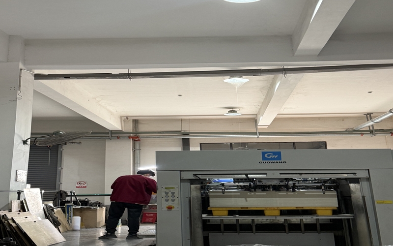
One of the first steps in applying color theory in printing is selecting the right color model. In digital displays, we use RGB (Red, Green, Blue), but in physical printing, CMYK (Cyan, Magenta, Yellow, Black) is the industry standard. CMYK allows us to reproduce colors more accurately in printed formats. At Wuxi Box Printing, we use advanced CMYK color calibration systems to ensure what you see in the design phase matches what you get on your final packaging.
Using the Color Wheel to Guide Choices
The color wheel is a fundamental tool in color theory. It helps identify:
Complementary colors: Colors opposite each other on the wheel (e.g., red and green), great for creating high contrast and visual excitement.
Analogous colors: Colors next to each other (e.g., blue, blue-green, green), which create a harmonious, calming effect.
Triadic colors: Colors evenly spaced around the wheel (e.g., red, yellow, blue), often used for vibrant, balanced palettes.
By understanding how these relationships work, you can create visually cohesive packaging that conveys your brand's message effectively.
Color Psychology: Influence Consumer Behavior
Colors are more than decoration—they influence perception and buying decisions. When choosing colors for printing your packaging, it’s essential to consider the psychological effects:
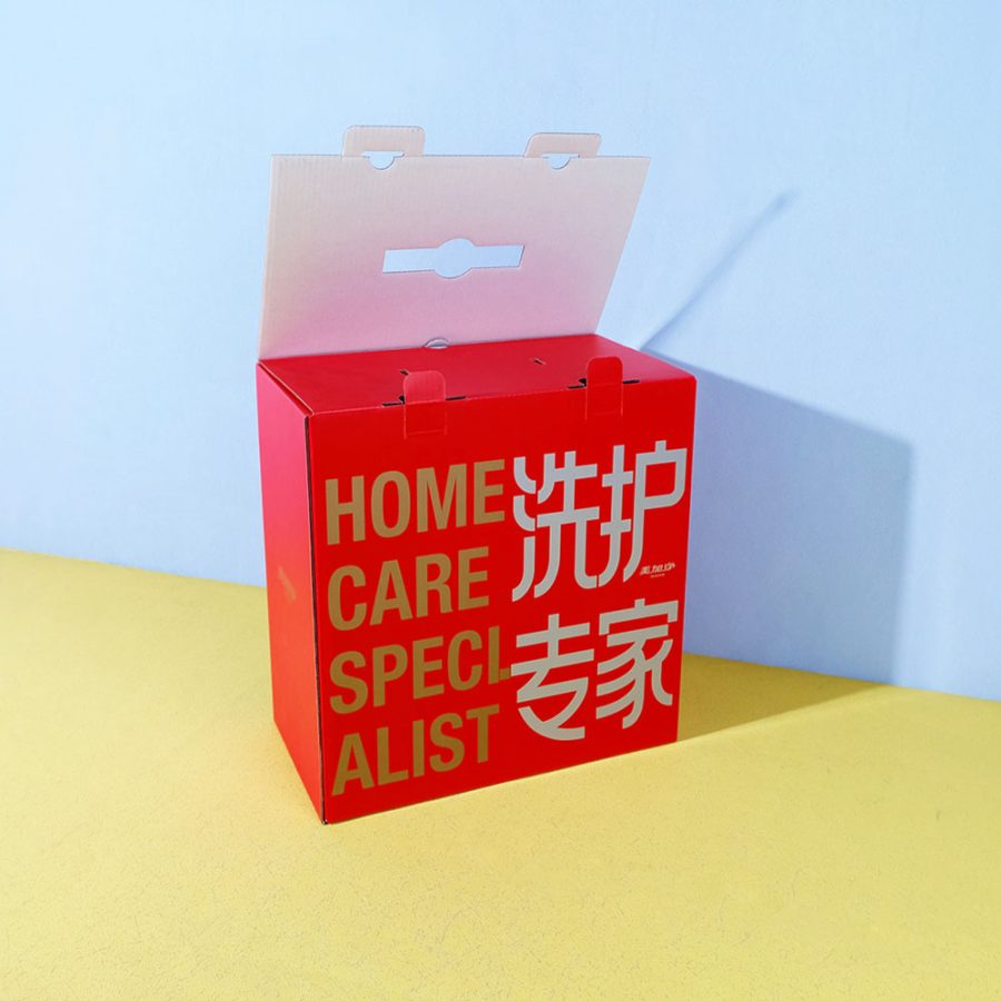
Red: Creates urgency and energy, ideal for sales and promotions.
Blue: Conveys trust and dependability, popular with finance, tech, and healthcare brands.
Green: Symbolizes nature, health, and sustainability.
Yellow: Evokes optimism and grabs attention.
Black: Communicates luxury, sophistication, and exclusivity.
At Wuxi Box Printing Technology, we work closely with clients to align these psychological principles with the goals of their product and target audience.
Color Harmony: The Secret to Beautiful Design
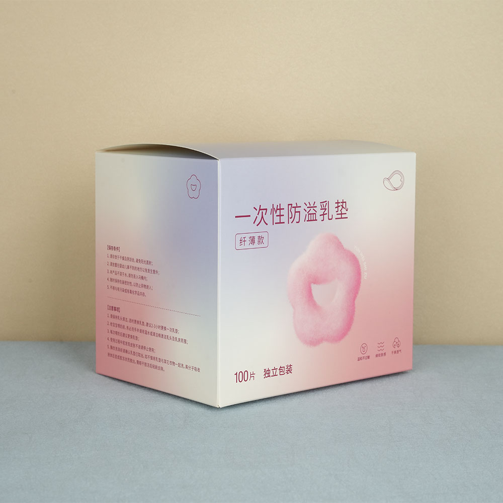
Color harmony refers to combinations of colors that are pleasing to the eye. Balanced color schemes ensure that no element feels out of place or overwhelms the viewer. This is critical in packaging design, where too many clashing colors can confuse consumers or dilute the brand message. By employing tools like Adobe Color or Pantone guides, our design experts ensure your packaging not only looks attractive but also maintains visual balance and professional quality.
Consistency Is Key: Color Matching Across Materials
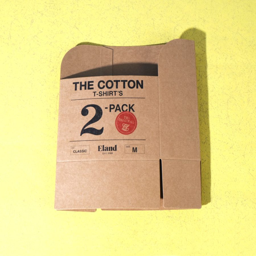
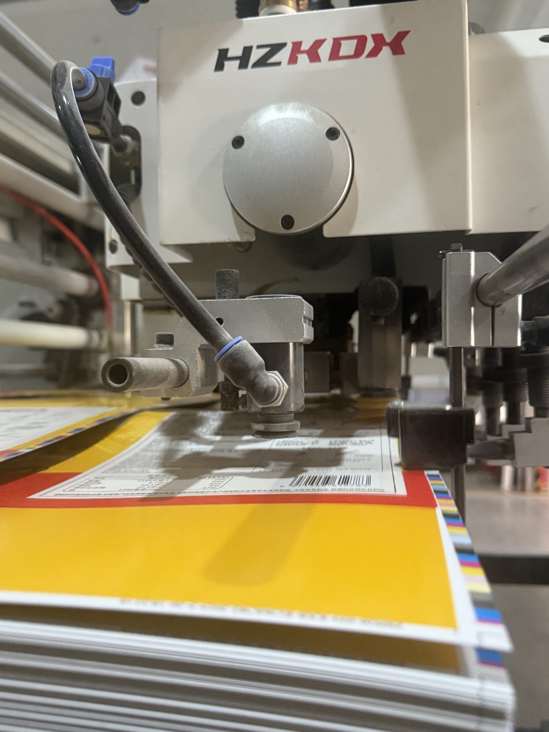
One of the biggest challenges in printing is maintaining consistent colors across different materials—cardboard, coated paper, kraft paper, or plastic. Because colors may appear different depending on the surface, lighting, and ink absorption, strict color management protocols must be followed. At Wuxi Box Printing Technology, we use Pantone Matching System (PMS) and high-precision digital calibration tools to guarantee color accuracy and consistency across every batch, material, and order.
Conclusion: Print with Purpose and Precision
Color isn’t just a visual detail—it’s a powerful communicator. By applying color theory to your packaging and print projects, you enhance your brand’s visibility, emotional appeal, and effectiveness in the marketplace. At Wuxi Box Printing Technology, we go beyond printing. We guide you through strategic color choices that strengthen your branding and improve customer engagement. Whether you’re launching a new product or revamping your packaging, let us help you turn color into a competitive advantage.


