The Psychology of Color in Packaging: How Color Influences Buying Decisions
When it comes to product packaging, the design, texture, and shape all play crucial roles. But one of the most powerful—yet often underestimated—elements is color. Color isn’t just a visual detail; it’s a psychological trigger that can influence how consumers feel about a product, how they perceive the brand, and ultimately, whether or not they decide to make a purchase.
At Wuxi Box Printing Technology, we understand that the right color choices can make your packaging not only more attractive but more effective in driving sales. Let’s explore how color psychology works in packaging and how you can apply it to give your product a competitive edge.
Color as a Silent Salesman
Color is often the first thing a customer notices about your packaging, even before reading any text or interacting with the product itself. Studies show that up to 85% of shoppers place color as a primary reason for purchasing a particular product. It only takes seconds for someone to form an impression—and color is a major part of that snap judgment.
By understanding what different colors represent and how they affect emotions, brands can craft packaging that speaks directly to their target audience.

What Different Colors Communicate
Here’s a breakdown of how commonly used colors in packaging influence consumer perception:
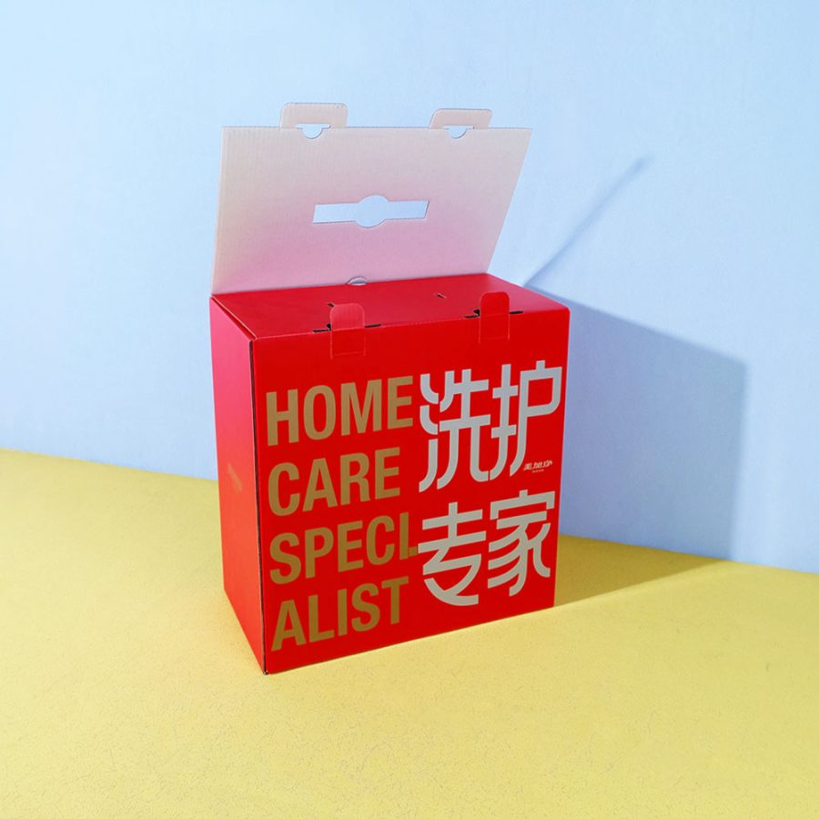
Red: Stimulates energy, urgency, and appetite. Ideal for food packaging or products aimed at younger audiences or impulse buyers. It’s bold, grabs attention, and suggests action.
Blue: Conveys trust, security, and professionalism. Commonly used in packaging for tech, healthcare, and finance-related products. It’s calming and dependable—perfect for brands that want to build long-term customer loyalty.
Green: Represents health, sustainability, and nature. Widely used for organic products, eco-friendly packaging, and wellness brands. Green signals freshness and balance.
Yellow: Associated with optimism, clarity, and youthfulness. Great for attracting attention on crowded shelves and for fun or budget-friendly products.
Black: Symbolizes luxury, sophistication, and power. Often used in high-end product packaging such as cosmetics, electronics, and premium beverages.
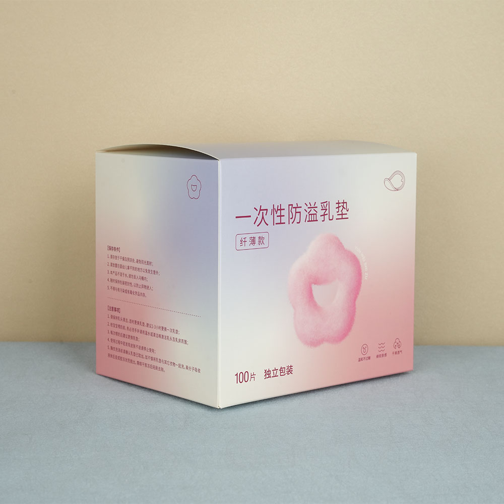
White: Clean, pure, and simple. Used for minimalistic designs and products that want to emphasize cleanliness, such as skincare or medical items.
Purple: Suggests creativity, elegance, and mystery. Often used for beauty products and items that want to feel exclusive or spiritual.
Orange: Energetic, playful, and friendly. Suitable for kids’ products, drinks, or anything that aims to be fun and accessible.
Pink: Soft, romantic, and nurturing. Traditionally used for products aimed at women, but modern brands are creatively using it across various categories.
Matching Color to Your Brand Personality
At Wuxi Box Printing Technology, we guide our clients to choose colors that align with both the brand identity and target audience. For example, a luxury skincare brand may benefit from a matte black box with gold accents, while an eco-conscious tea brand might shine with earth-tone packaging and green motifs.
Color must reflect the values and mood of the product. Is it premium? Playful? Practical? Natural? Answering these questions helps determine the best color scheme that resonates emotionally with consumers.

Cultural Considerations and Global Markets
Color meanings can vary dramatically across cultures. While red signifies luck and celebration in China, it can symbolize danger in some Western contexts. Similarly, white may represent purity in one country but mourning in another. If your packaging is intended for international markets, these cultural nuances must be considered.
At Wuxi Box Printing, we help brands tailor their packaging colors for different geographic and cultural contexts to ensure maximum impact and relevance.
Color Harmony and Contrast
In addition to selecting the right colors, understanding how color combinations work is vital. Contrasting colors can create strong visual hierarchy and draw attention to key information, while harmonious colors can create a soothing, unified look.
Using a consistent and balanced color palette helps build brand recognition. For example, iconic brands like Coca-Cola or Tiffany & Co. are instantly recognizable because of their consistent use of red and turquoise blue, respectively.
Conclusion: Design with Psychology in Mind
The power of color in packaging design goes far beyond aesthetics—it has a direct impact on consumer perception and buying behavior. At Wuxi Box Printing Technology, we combine technical printing expertise with a deep understanding of color psychology to help our clients create packaging that not only looks great but performs well in the market.